Why 2026 Is All About Color & Warmth

by Kristen McCutcheon

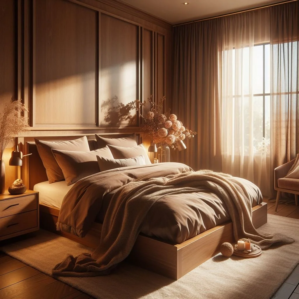
After years dominated by cool grays, stark whites, and minimalist palettes, 2026 marks a shift. Homeowners and designers are moving toward warmer, more expressive, and emotionally rich interiors — spaces that feel cozy, grounded, and personal rather than impersonal or overly sleek. Homes and Gardens+2Architectural Digest+2

Rather than color being reserved for small accent pieces, full rooms drenched in mood-setting hues — or carefully layered palettes combining neutral “bases” with bold tones — are rising in popularity. Benjamin Moore+2ELLE Decor+2

With that in mind, here are the biggest color themes to watch in 2026.

🌿 Earthy, Nature-Inspired Neutrals


  • Soft beiges, warm taupes, clay, greige, mushroom and “sand-washed” neutrals — tones that evoke earth, stone, and natural materials. In 2026, these are replacing the “cool gray / crisp white” minimalism of recent years. PAINT CORPS®+2JRL Interiors+2

  • These colors give rooms a calm, soothing, and timeless foundation — perfect when layered with wood, linen, jute or other natural textures. Homes and Gardens+2Martha Stewart+2

  • If you want a versatile backdrop that will stand the test of time but feel elevated, a cozy neutral base like these is a safe bet. Benjamin Moore+2Decorilla+2

Best for: Living rooms, whole-home palettes, foundations you plan to layer with furniture, artwork, and textiles.

🍂 Rich Earth & Terracotta Hues, Deep Browns and Rusty Reds

  • Expect terracotta, warm mahogany, deep earthy reds, rust, chocolate brown — shades that bring grounding, warmth, and a slightly moody, nostalgic feel. Country Living+2PPG Paints+2

  • These hues add depth and personality, whether used as feature walls, cabinetry, or statement areas — especially in rooms where you want a cozy, intimate vibe (like dining rooms, reading corners, home libraries). Homes and Gardens+2JRL Interiors+2

  • Given their warmth and richness, they pair wonderfully with natural materials (wood, leather), vintage furniture, and softer textiles, creating a classic yet soulful atmosphere. PAINT CORPS®+2PPG Paints+2

Best for: Dining rooms, kitchens, dens, home offices, any room where you want drama, warmth, or cozy intimacy.

🌲 Deep Greens, Moss, and Nature-Driven Hues

  • Nature-inspired greens — ranging from smoky jade and eucalyptus to olive and forest green — are trending as the new “grounding neutrals.” Valspar+2Kylie Interiors+2

  • These greens evoke calm, bring a touch of the outdoors in, and work especially well when paired with wood, stone, or organic materials for a “natural sanctuary” vibe. PAINT CORPS®+2HGTV Home by Sherwin-Williams+2

  • As they’re still versatile and somewhat neutral, they can serve as a base for accent colors, or be used boldly for cabinetry, feature walls, or statement pieces. HGTV Home by Sherwin-Williams+2ELLE Decor+2

Best for: Kitchens (cabinets, islands), bathrooms, bedrooms — anywhere you want a grounded, restful feel.

✨ Pastels, Soft Whites & Subtle Warm Whites — A Whisper of Calm

  • Lighter, softer shades — muted blush, pastel pinks, gentle off-whites, creamy beiges, and subtle warm whites — are trending for those who want a calm, airy, and sophisticated base. Real Simple+2Decorilla+2

  • These light palettes create versatile backgrounds that let furniture and decor stand out, and they work especially well in bedrooms, bathrooms, and smaller spaces where you want light, softness, and a serene vibe. Kylie Interiors+2Ricciardi Brothers+2

  • When paired with natural textures and warm materials (wood, woven textiles, soft lighting), soft colors can feel modern, cozy, and timeless — avoiding the sterility of stark minimalism. Martha Stewart+1

Best for: Bedrooms, bathrooms, small spaces, and homes leaning toward a lighter, airy aesthetic.

🛋️ How to Use the 2026 Palette in Your Own Home

  • Start with a neutral base. Use warm neutrals or soft whites for walls or larger surfaces — they give flexibility and longevity while letting you build around them with richer colors.
  • Layer intentionally. Combine earthy neutrals with deeper tones (greens, terracottas, jewel hues) through furniture, textiles, accent walls or décor.
  • Mix textures and materials. Natural elements like wood, clay, linen, stone, or rattan pair beautifully with 2026’s nature-inspired palettes, giving depth and personality.
  • Use bold colors as accents. Instead of painting entire rooms in deep hues, try using them for cabinetry, shelving, trim, or smaller rooms to create drama without overwhelming.
  • Let the light guide you. Softer tones suit rooms with low light or smaller spaces, while deeper, saturated hues shine in larger rooms or those with ample natural light.

✔️ Final Thought

Whether you’re leaning toward cozy earthiness, dramatic moody elegance, or soft serenity — 2026 is giving us permission to explore richer, more expressive palettes. Interiors are becoming about personality, warmth, and emotional comfort rather than just clean lines or neutral minimalism.


GET MORE INFORMATION

Name
Phone*
Message